import pandas as pd
import numpy as npClassification: Logistic Regression
We have seen the x-axis for the independent variable, and y-axis for the dependent, target variable for regression.
In classification problems, we usually start with:
- at least 2 independent variables: \(x_1\) and \(x_2\)
- and try to classify a binary target: \(y=\{0,1\}\)
Let’s make up some data (X, y):
from sklearn.datasets import make_blobs

centers = [
    [5, -5],
    [5, 5]
]

X, y = make_blobs(
    n_samples=100,
    centers=centers,
    random_state=40
)
import matplotlib.pyplot as plt
fig, ax = plt.subplots(figsize=(6, 4))
scatter = ax.scatter(
x=X[:, 0],
y=X[:, 1],
c=y, # color
edgecolor="black"
)
ax.set(
title="Synthetic Dataset",
xlabel="$X_1$",
ylabel="$X_2$"
)
_ = ax.legend(*scatter.legend_elements(), title="Classes")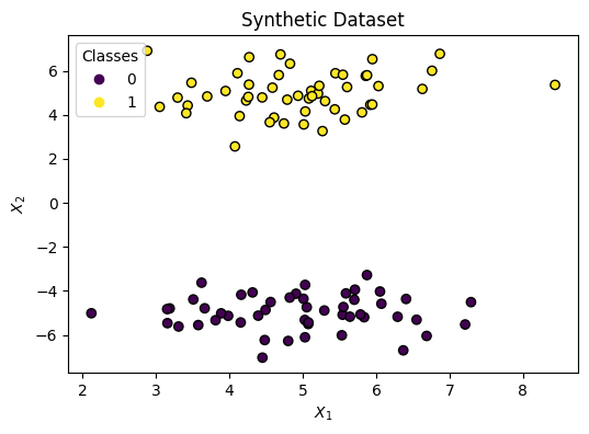
Decision Boundary
We need to draw a Line that splits the two classes. We can do that with the following formula:
\[ h(x) = w_1 x_1 + w_2 x_2 + b \]
With this in mind, the graph will have both axes for the independent variables (\(x_1\) and \(x_2\)) without showing the target \(y\).
Changing the parameters has the following effect:
- Rotation: \(w_1\) and \(w_2\)
- Shifting: \(b\)
Fitting the parameters: \(w_1, w_2, b\) sets the Decision Boundary between two classes: \(y=0, y=1\).
from sklearn.linear_model import LogisticRegression

model = LogisticRegression()
model.fit(X, y)LogisticRegression()In a Jupyter environment, please rerun this cell to show the HTML representation or trust the notebook.
On GitHub, the HTML representation is unable to render, please try loading this page with nbviewer.org.
Parameters
Let’s look at the learned parameters:
print("w1: ", model.coef_[0][0].round(2))
print("w2: ", model.coef_[0][1].round(2))
print("b : ", model.intercept_[0].round(2))
w1: -0.04
w2: 1.28
b : 0.34Now let’s plot the decision boundary:
from sklearn.inspection import DecisionBoundaryDisplay

fig, ax = plt.subplots(figsize=(6, 4))

DecisionBoundaryDisplay.from_estimator(
    estimator=model,
    X=X,
    ax=ax,
    response_method="predict_proba",
    alpha=0.5,
    xlabel="$X_1$",
    ylabel="$X_2$"
)

scatter = ax.scatter(
    x=X[:, 0],
    y=X[:, 1],
    c=y,
    edgecolor="k"
)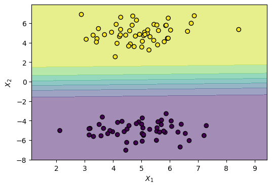
Notice the gradual shift in color. That’s because LogisticRegression models a smooth probability, where the middle is a 0.50 (equal) probability of both classes, rather than a hard threshold.
The Sigmoid Function
This is accomplished using a logistic function (also known as sigmoid function), which looks like this:
\[ \sigma(z) = \frac{1}{1 + e^{-z}} \]
import numpy as np
import matplotlib.pyplot as plt


def sigmoid(z: np.ndarray) -> np.ndarray:
    return 1 / (1 + np.exp(-z))


z = np.linspace(-6, 6, 400)
sigma = sigmoid(z)

fig, ax = plt.subplots(figsize=(6, 4))
ax.plot(z, sigma, label=r"$\sigma(z)$")
ax.axhline(0.5, color="gray", linestyle="--", linewidth=1)
ax.axvline(0.0, color="gray", linestyle="--", linewidth=1)
ax.set(
    title="Logistic (Sigmoid) Function",
    xlabel=r"$z$",
    ylabel=r"$\sigma(z)$",
)
ax.legend()
ax.grid(True)
plt.show()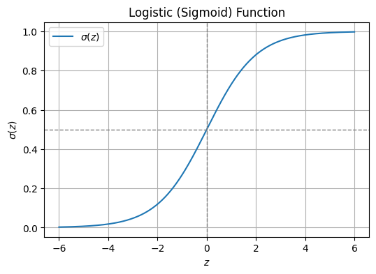
Demo: Sigmoid
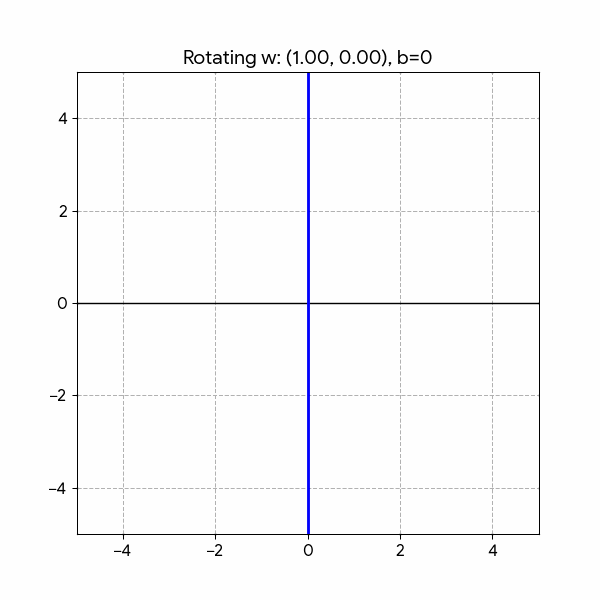
Play with the Desmos demo and notice how:
- Adjusting the intercept \(w_0\) shifts the curve left or right
- Updating \(w_1\) affects the slope of the S-curve.
- Higher absolute values make the curve steeper
- While lower values make it more gradual
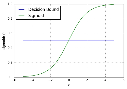
Decision Threshold
The suffix “Regression” often causes confusion, but it is technically accurate. Logistic regression is fundamentally a regression algorithm because it estimates a continuous numerical value: a probability between 0 and 1.
\[ 0 \le p \le 1 \]
It is also known in the literature as:
- logit regression
- maximum-entropy classification (MaxEnt)
- log-linear classifier
It only becomes a classifier when we apply a decision threshold to that probability. For example, a standard rule is:
if p >= 0.5:y = 1if p < 0.5:y = 0
We simply plug our decision boundary equation. Read: “the probability that \(y=1\) given \(x\) (the data) is equal to”:
\[ p(y=1|x) = \frac{1}{1 + e^{-(h(x))}} = \frac{1}{1 + e^{-(w_1 x_1 + w_2 x_2 + b)}} \]
We can look at it in 3D, where height corresponds the probability of y being 1 given x1 and x2:
# 3D Plot: decision boundary as probability surface using meshgrid
import numpy as np

# Create meshgrid over the feature space (same range as the 2D plot)
x1_min, x1_max = X[:, 0].min() - 0.5, X[:, 0].max() + 0.5
x2_min, x2_max = X[:, 1].min() - 0.5, X[:, 1].max() + 0.5
xx1, xx2 = np.meshgrid(np.linspace(x1_min, x1_max, 80), np.linspace(x2_min, x2_max, 80))

# Stack grid points and get P(y=1) from the logistic regression model
X_grid = np.c_[xx1.ravel(), xx2.ravel()]
Z = model.predict_proba(X_grid)[:, 1]  # probability of class 1
Z = Z.reshape(xx1.shape)

# 3D figure: x1, x2 on the base, probability on the z-axis
fig = plt.figure(figsize=(8, 6))
ax = fig.add_subplot(111, projection="3d")
ax.plot_surface(xx1, xx2, Z, alpha=0.6, cmap="RdYlBu_r")
ax.scatter(X[:, 0], X[:, 1], y, c=y, edgecolor="k", s=50)
ax.set(xlabel="$X_1$", ylabel="$X_2$", zlabel="$P(y=1|x)$", title="Logistic regression decision boundary (3D)")
plt.tight_layout()
plt.show()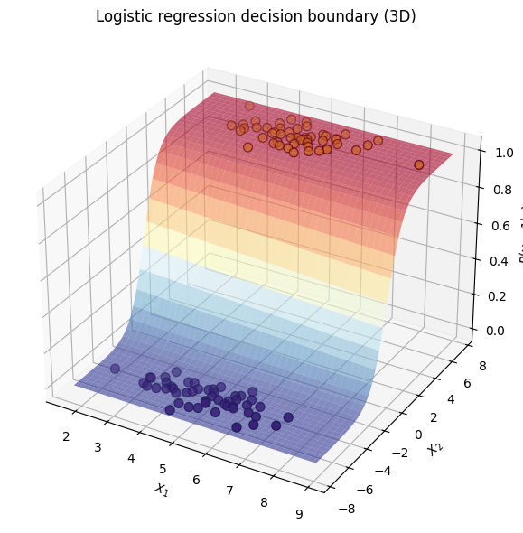
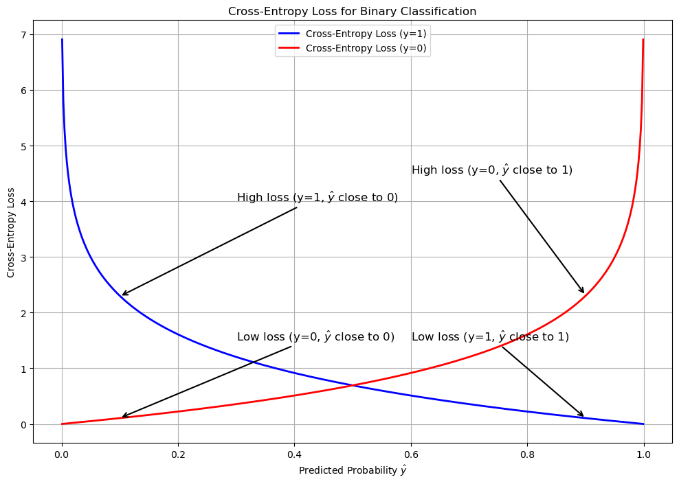
How It Learns: Log Loss
Unlike standard linear regression, which minimizes the Mean Squared Error (the distance between predicted and actual points), logistic regression optimizes a cost function called Log Loss (or Binary Cross-Entropy).
Binary Cross Entropy
\[BCE = - \frac{1}{m} \sum_{i=1}^m \left[ y_i \log(\hat{y}_i) + (1 - y_i) \log(1 - \hat{y}_i) \right]\]
Where
- \(BCE\): The total log loss calculated across the entire dataset.
- \(m\): The total number of observations.
- \(y_i\): The true, discrete binary label for the \(i\)-th observation (strictly 0 or 1).
- \(\hat{y}_i\): The model’s predicted probability that the \(i\)-th observation belongs to class 1 (a continuous value bounded strictly between 0 and 1).
- \(\log\): The natural logarithm (base \(e\)).
Categorical Cross-Entropy
When classifying more than two mutually exclusive categories, the binary log loss generalizes into categorical cross-entropy.
\[ CCE = -\frac{1}{m} \sum_{i=1}^m \sum_{k=1}^K y_{i,k} \log(\hat{y}_{i,k}) \]
Where:
- \(K\): The total number of discrete classes.
- \(y_{i,k}\): A binary indicator (strictly 0 or 1) denoting whether class \(k\) is the correct ground-truth classification for observation \(i\).
- \(\hat{y}_{i,k}\): The model’s predicted probability that observation \(i\) belongs to class \(k\).
Beyond Binary Classification
To extend the algorithm beyond binary classification and into multi-class classification, there are two approaches:
- Multinomial: Learns all classes jointly; using the CCE loss (recommended in practice)
- One vs Rest: One binary classifier per class; using multiple BCE losses (used here to demonstrate the sigmoid curve in 3D)
We demonstrate the difference by going through the following steps:
- Generate a 3-class dataset
- Train multinomial and one-vs-rest logistic regression
- Plot decision boundaries (regions from
predict)
- Plot lines (where p(class) = 0.5)
1. Dataset
Synthetic 3-class data with sklearn.datasets.make_blobs:
import numpy as np
from sklearn.datasets import make_blobs

centers = [
    [-5, 0],
    [0, 1.5],
    [5, -1]
]

X, y = make_blobs(
    n_samples=1_000,
    centers=centers,
    random_state=40
)

transformation = [
    [0.4, 0.2],
    [-0.4, 1.2]
]
X = np.dot(X, transformation)
import matplotlib.pyplot as plt
fig, ax = plt.subplots(figsize=(6, 4))
scatter = ax.scatter(
X[:, 0], # x-axis
X[:, 1], # y-axis
c=y, # color by class
edgecolor="black"
)
ax.set(
title="Synthetic Dataset",
xlabel="Feature 1",
ylabel="Feature 2"
)
_ = ax.legend(*scatter.legend_elements(), title="Classes")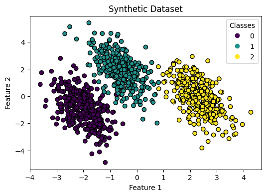
2. Train both classifiers
Multinomial and one-vs-rest logistic regression on the same data.
from sklearn.linear_model import LogisticRegression

logistic_regression_multinomial = LogisticRegression()
logistic_regression_multinomial.fit(X, y)
accuracy_multinomial = logistic_regression_multinomial.score(X, y)
print(accuracy_multinomial)0.995from sklearn.multiclass import OneVsRestClassifier
logistic_regression_ovr = OneVsRestClassifier(LogisticRegression())
logistic_regression_ovr.fit(X, y)
accuracy_ovr = logistic_regression_ovr.score(X, y)
print(accuracy_ovr)0.9763. Decision boundaries
Regions from predict for each model.
from sklearn.inspection import DecisionBoundaryDisplay

fig, (ax1, ax2) = plt.subplots(1, 2, figsize=(12, 5), sharex=True, sharey=True)

for model, title, ax in [
    (
        logistic_regression_multinomial,
        f"Multinomial Logistic Regression\n(Accuracy: {accuracy_multinomial:.3f})",
        ax1,
    ),
    (
        logistic_regression_ovr,
        f"One-vs-Rest Logistic Regression\n(Accuracy: {accuracy_ovr:.3f})",
        ax2,
    ),
]:
    DecisionBoundaryDisplay.from_estimator(
        model,
        X,
        ax=ax,
        response_method="predict_proba",
        alpha=0.8,
    )
    scatter = ax.scatter(X[:, 0], X[:, 1], c=y, edgecolor="k")
    legend = ax.legend(*scatter.legend_elements(), title="Classes")
    ax.add_artist(legend)
    ax.set_title(title)
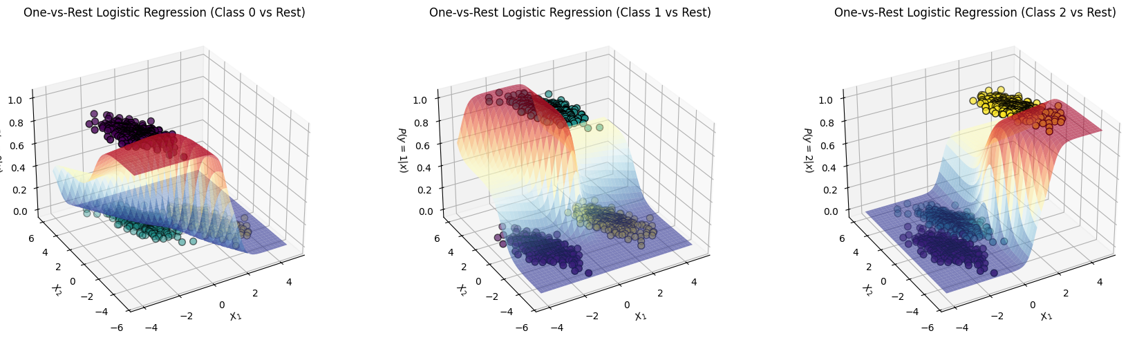
It is helpful to see the one-vs-rest plot in 3D, we’ll have 3 separate plots where the Positive class is lifted up (because it’s probability is maximized):
# 3D Plots: decision boundaries as probability surfaces for one-vs-rest logistic regression (each class)
import numpy as np

# Create meshgrid over the feature space (same range as the 2D plot)
x1_min, x1_max = X[:, 0].min() - 0.5, X[:, 0].max() + 0.5
x2_min, x2_max = X[:, 1].min() - 0.5, X[:, 1].max() + 0.5
xx1, xx2 = np.meshgrid(np.linspace(x1_min, x1_max, 80), np.linspace(x2_min, x2_max, 80))

# Stack grid points for predictions
X_grid = np.c_[xx1.ravel(), xx2.ravel()]

# Make three 3D plots: probability surface for each of three classes
fig = plt.figure(figsize=(18, 5))

classes = np.unique(y)
for i, class_idx in enumerate(classes):
    Z = logistic_regression_ovr.predict_proba(X_grid)[:, class_idx]
    Z = Z.reshape(xx1.shape)
    ax = fig.add_subplot(1, 3, i + 1, projection="3d")
    # Plot the probability surface for class class_idx
    surf = ax.plot_surface(xx1, xx2, Z, alpha=0.6, cmap="RdYlBu_r")
    # Scatter the training data with its true class as color
    ax.scatter(X[:, 0], X[:, 1], (y == class_idx).astype(float), c=y, edgecolor="k", s=50)
    ax.set(
        xlabel="$X_1$",
        ylabel="$X_2$",
        zlabel=f"$P(y={class_idx}|x)$",
        title=f"One-vs-Rest Logistic Regression (Class {class_idx} vs Rest)"
    )
    ax.view_init(elev=30, azim=-120)  # Optional: adjust view

plt.tight_layout()
plt.show()